The Natural Spot

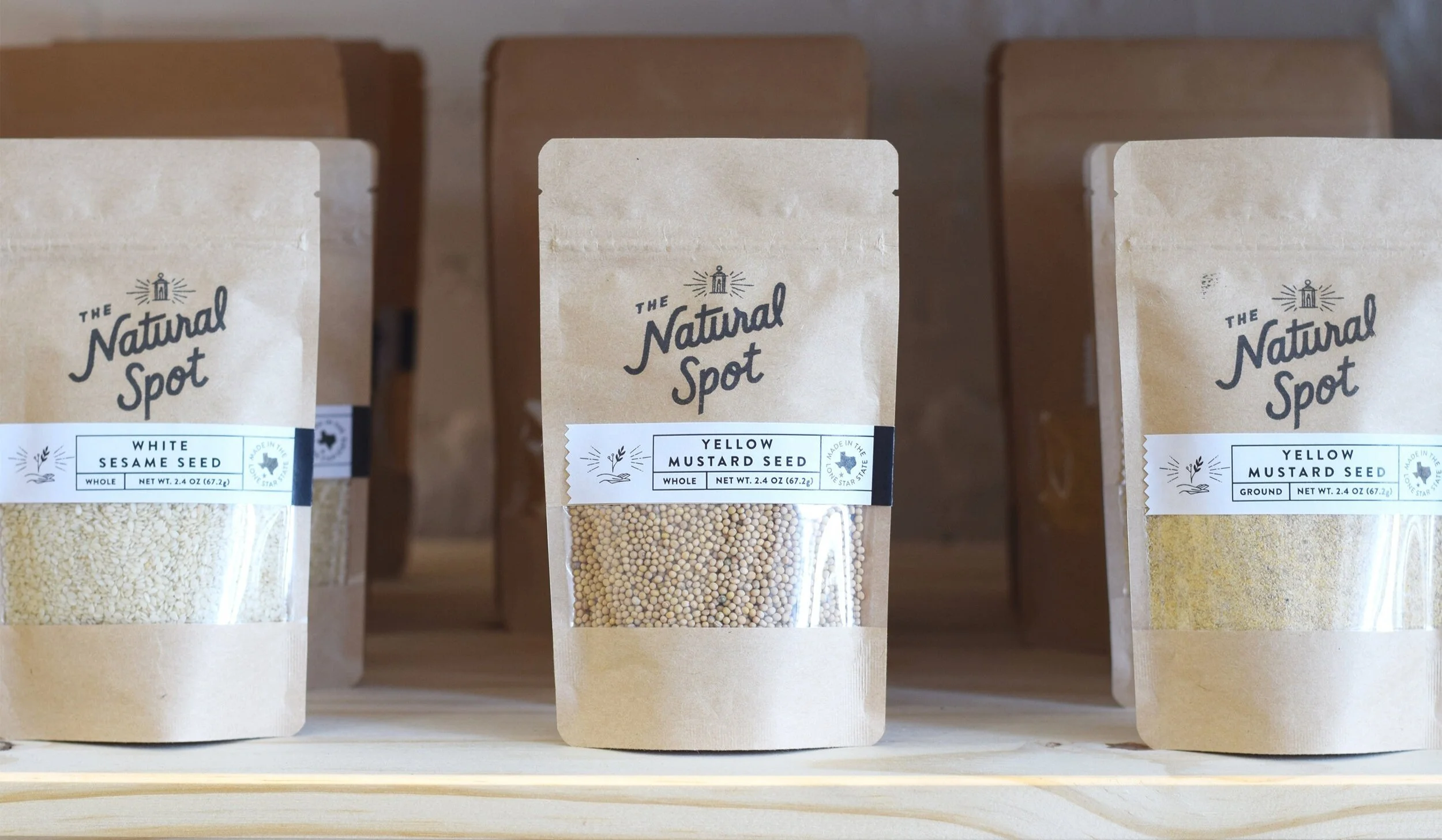
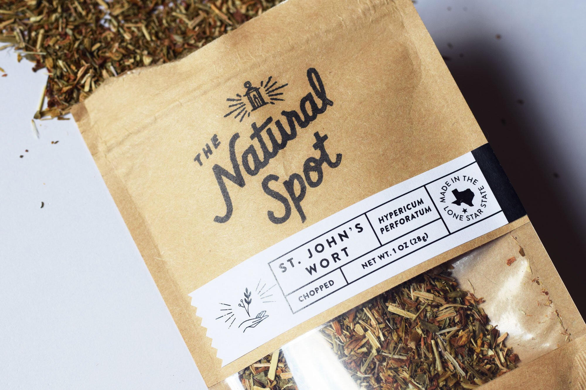
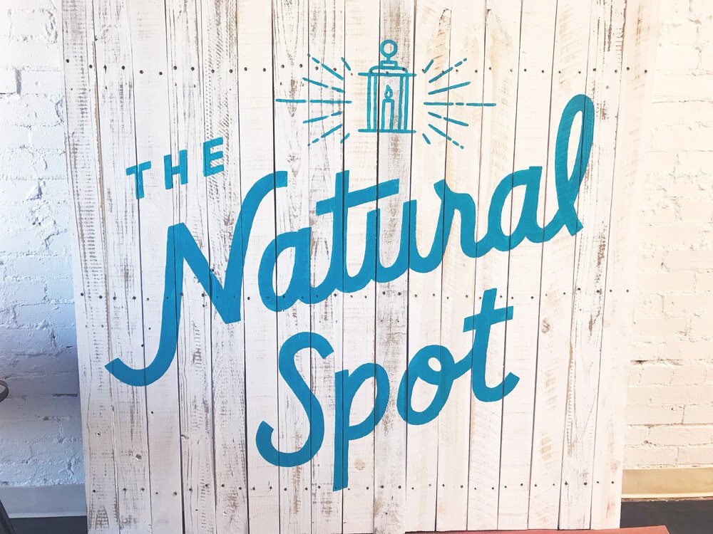
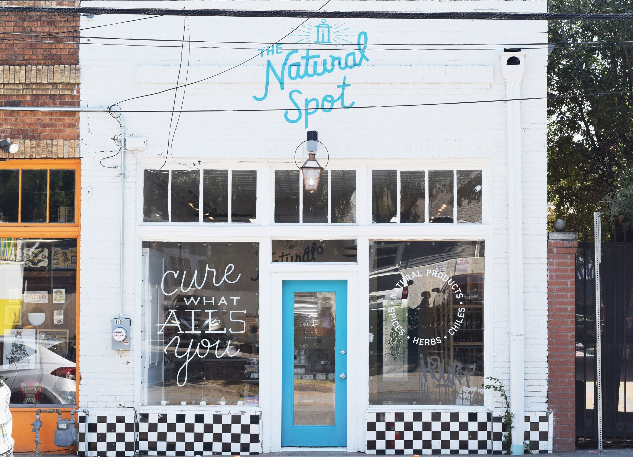
The Natural Spot is an herbs and natural remedies shop in the heart of Dallas’s Bishop Arts District. They needed a cohesive brand identity that communicates nature, handmade, organic, and health. This extended to the packaging for their herbs and spices, the storefront design, and the interior design of the shop.

Client: The Natural Spot
Art Direction:
Chris Sipriano, Eric Rodriguez

lizvolpi
 

Identity System

Symbolism: The candle-lit lantern beckons those who seek natural solutions for common ailments. It’s symbolic of the lantern that hangs above the doorway at the brick and mortar shop. 

Color: Since blue is a color commonly associated with wellness and green often represents organic, we chose a hue that sits between the two on the color wheel: teal. It evokes thoughts of cleanliness, nature, healing.

 
lizvolpi


Packaging

Chris and Eric had already purchased packages for their herbs and spices, but needed an attractive way of presenting information on them. Our solution combines use of a rubber stamp and ribbon-shaped labels, which extend to the back to house information.

 
lizvolpi
lizvolpi